Figma is a real-time collaborative UI design tool, extremely useful for frontend development.

Shortcuts
v   # Move tool    (same as in Photoshop)
f   # Frame tool
p   # Pen tool
t   # Text tool
h   # Hand tool
c   # Comment tool

# Panel
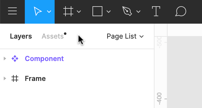
alt + 1            # Switch to layers tab
alt + 2            # Switch to assets tab
shift + e          # Quickly toggle betweeen design and prototype tabs

# Layer
ctrl + r           # Rename layer

# Group
ctrl + g           # Creates a group that contains all highlighted elements
ctrl + shift + g   # Ungroup highlighted elements

# Frame
ctrl + alt + g     # Creates a frame that contains all highlighted elements
ctrl + shift + g   # Unframes highlighted elements (same shortcut as ungrouping)

# Component
ctrl + alt + k     # Creates a component that contains all highlighted elements
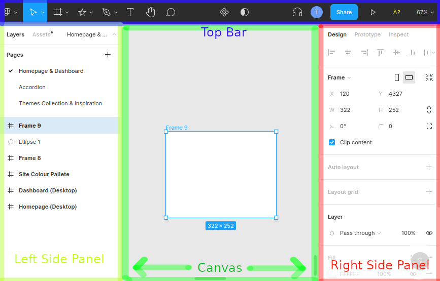
Left Panel

Layers
All your design elements appear in the layers panel and will be nested within other elements such as frames. Each design element has a symbol that tells you what type of element it is:
- Frames — usually the top-level container for everything else
- Groups — a container for multiple elements, letting them be moved and resized uniformly and organise your layers
- Components — reusable design elements in your assets
- Instance — instantiations of components
- Text
- Shape
- Image
- GIF
You can have multiple pages in a single Figma file. Each page has its own canvas.
Right Panel
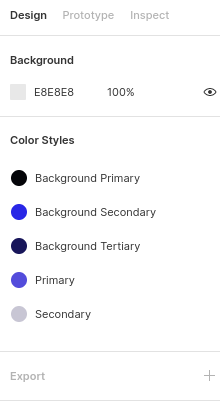
- Design — lets you view and tweak properties of any design element. What is shown in this panel is determined by what you currently have selected
- If no element is selected, then you’ll see some local styles and canvas properties

- If no element is selected, then you’ll see some local styles and canvas properties
- Prototype — lets you set up interactive user-flow logic
- Inspect — shows you a summary of properties and how the design maps to real CSS code (or Android/iOS code)
Components
Components are reusable design elements. You can create them from layers, groups and frames.
- Master component — or just component, defines the base properties of a component.
- Instance — a copy of the master component where you can override properties.
- Copy and pasting a master component will create an instance of a master component.
- Updating the master component’s properties will cause its instances to ‘sync’ with that change.
- Useful operations:
- Jump to master component
- Reset instance — clear all overrides
- Detach from master
Libraries
Libraries are groups of components that can be published or imported.
Prototyping
Lets you set up interactive logic in presentation mode. Examples of common use cases:
- Setting up transitions between frames based on user events like clicking, hovering, etc.
- Overflow behaviour — lets you set up scrolling, good for demonstrating carousels for example
You can create connections between any element and any top-level frame.