See https://tymz.notion.site/UI-UX-7fb9a728bfc946fcbe92ff640b371a2d.
See UI inspiration.
Note for Developers
Design is not fundamentally about making things pretty. The prettiness of a thing you design is often a side effect of making it usable, accessible, learnable and delightful to use. This makes design problems engineering problems.
“Most people make the mistake of thinking design is what it looks like, people think it’s this veneer — that the designers are handed this box and told, ‘Make it look good!’ That’s not what we think design is. It’s not just what it looks like and feels like. Design is how it works.” — Steve Jobs.
Always prototype designs before you code. Never design from your code. Use a tool like Figma, Photoshop, Illustrator, or just pen and paper.
Aesthetic-Usability Effect
The aesthetic-usability effect is a phenomenon where humans perceive more aesthetic designs as more intuitive/easier to use than those considered to be less aesthetically pleasing (even if it is not easier to use).
This is a well-studied phenomenon, not just a claim about human behaviour. If you focus on designing a product focusing heavily on usability, it will inevitably be seen as aesthetic. Conversely, if you polish your visuals, it will be seen as more usable and users will be more tolerant of poor usability.
This is related to the Halo effect.
Gestalt Principles
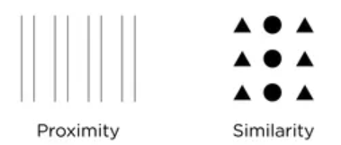
Gestalt theory asserts that the human brain always seeks to group components and identify structures and patterns. Some useful practical principles from Gestalt theory:
- Similarity. Group similar things together and the user will perceive them as similar without thought.
- Proximity. Similar things are put closer together. Your UI should arrange things similar in purpose in close proximity and keep them far from things different in purpose.
 (source)
Spacing
Negative spacing is a useful weapon against visual noise. It helps the read scan for what they need. Consider using:
- Larger padding and margin.
- Larger line spacing and letter spacing.
Typography
Typography makes a huge difference. Invest time in picking one that best expresses your frontend’s ‘personality’.
Font pairing is a common practice where you pick two (or more) fonts that contrast with each other. For some reason, this looks better:
 Use generators online or handpicked font pairings rather than sticking to one font.
Colour
Figma recommends to use black, white, one primary colour, one secondary and tones of each. Note that:
- Tint — the addition of white to a colour.
- Shade — the addition of black to a colour.
- Tone — the addition of grey to a colour (ie. tinting and shading).