
CSS (Cascading Style Sheets) is a declarative language for describing document styling. Also see CSS Cookbook and SCSS.
Core
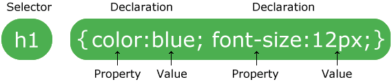
CSS files are just a sequence of rule sets which consists of a selector and a declaration block:
 CSS can be applied in a few ways:
- Inline on an element, such as
<h1 style="color: green;">. - Inside a
<style>element. - Linked externally with
<link ref="stylesheet" href="...">.
Selectors
A selector is a string that targets the HTML element you want to apply some styling rules to. A selector has a specificity value. When two styles conflict (which often happens because of inheritance, which style is chosen is based on which selector has a higher specificity.
| Selector | Syntax | Result | Specificity |
|---|---|---|---|
| Element | div | All divs. | 1 |
| Class | .className | All elements with class="className". | 10 |
| ID | #id | Element with id="id" | 1000 |
| Universal | * | All elements. | 0 |
| Attribute | div[attr] or div[attr="val"] | All divs with attr or attr="val". | 10 |
| Pseudo-class | div:pseudo-class | All divs that satisfy a certain state (pseudo-class). | 10 but depends. |
| Pseudo-element | div:pseudo-element | The specific pseudo-element of all divs. | 1. |
| Descendant combinator | div p | All ps inside a div. | |
| Child combinator | div > p | All ps that are direct children of a div. | |
| Adjacent sibling combinator | div + p | All ps that follow directly after a div. | |
| General sibling combinator | div ~ p | All ps that follow after a div. |
Inheritance
When you apply div { color: green; }, all children also implicitly have the rule color: green; set.
Box Model
Every element follows the box model below.
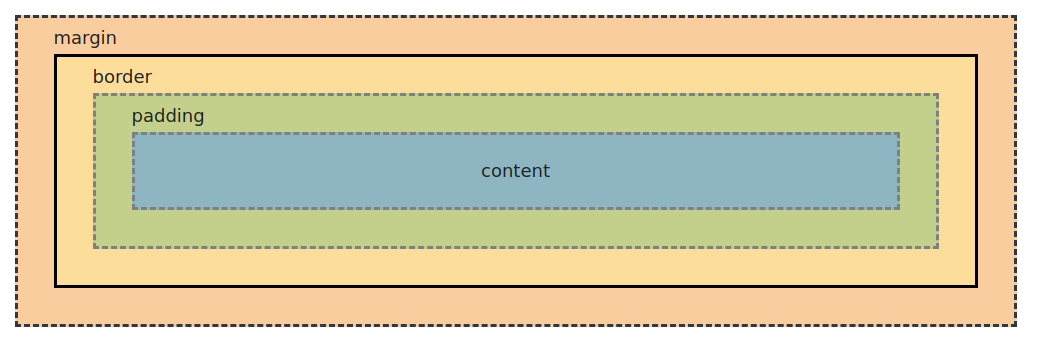
heightandwidthaffect only the inner content box, so the actual dimensions of the element will take up more space if you have padding, border and margin. To change this, setbox-sizing: border-boxto use the alternative CSS box model.
Display
Boxes are either block-level or inline-level. You change this by setting:
display: block;
display: inline;
display: inline-block;  /* Lets you set the width, height and padding/margins. */
When you do
display: flexordisplay: grid, you’re changing the inner display type, meaning that the children will behave according to the Flexbox or Grid specification.
Also, when you do display: inline-flex, you are making the container display inline rather than block, not the children.
At-Rules
At-rules are special instructions.
| Name | Example | Description |
|---|---|---|
| import | @import "path" or @import url(...) | Brings in another stylesheet. |
| font-face | @font-face { font-family: "My Font"; src: url(...) format('truetype'); } | Defines a custom font. |
| media | @media screen and (min-width: 300px) { ... } | Executes a media query to conditionally apply styles. |
| keyframes | @keyframes myAnim { from {...} to {...} }. See docs. | Defines myAnim which you can attach to an element by doing animation: myAnim 1s infinite; for example. |
| There are way more at-rules. |
Pseudo-Class
Pseudo-classes represent special states of an element that you can select for using selector:pseudo-class. See all of them on MDN.
| Pseudo-class selector | Description |
|---|---|
:hover | When mouseover on an element. |
:active | When mousedown-ed on an element. |
:focus | After an element is clicked on, or when focused on by tab. |
:first-child | The first element in a group of siblings. Eg. li:first-child selects the first li. |
:last-child | Like first-child but selecting the last. |
:nth-child | Given a linear function of n, selects every f(n) element for n = 0, 1, .... Eg. li:nth-child(2n+3) selects 3rd, 5th, etc. |
Pseudo-Element
Pseudo-elements are some specific parts of an element. They’re selectable with ::pseudo-element. See all of them on MDN.
| Pseudo-element selector | Description |
|---|---|
::before | |
::after | |
::first-letter |
Position
position: static;    /* Default val. Properties: `top`, `left`, `right`, `bottom` have no meaning. */
          relative;  /* Like static, but the positioning properties do have meaning. */
          absolute;  /* Takes this element out of the normal document flow.
                        It's positioned relative to the nearest `relative` ancestor. */
          fixed;     /* Like absolute, but relative to the viewport. */
          sticky;    /* Like relative and fixed. When scrolling past a sticky element,
                        it 'becomes' fixed, otherwise it stays as relative.
                        It 'sticks' around on the viewport after you've scrolled past it. */
Media Query
Media queries let you conditionally apply styles based on the user’s screen size (among other things). This, Flexbox and Grid are the main tools for implementing responsive web designs.
/* If screen width >= 400px, apply style rules within. */
@media screen and (min-width: 400px) { ... }
@media (width <= 400px) { ... }                /* Alternative syntax. */

/* Clamped dimensions. */
@media screen and (min-width: 100px) and (max-width: 400px) { ... }
@media (100px <= width <= 400px) { ... } /* Alternative syntax. */Note: a big part of responsive design is just making elements shrink in width when the viewport shrinks in width. You can accomplish this with media queries, however it’s cleaner to just something like this:
width: clamp(200px, 50%, 600px);
                    ^ preferred
Here, an element will default to a preferred width of 50% but will fall back to 200px if the viewport is too small.
Flexbox
Flexbox is a layout model for getting things neatly arranged on a row or column. For layout in 2-dimension, use Grid.
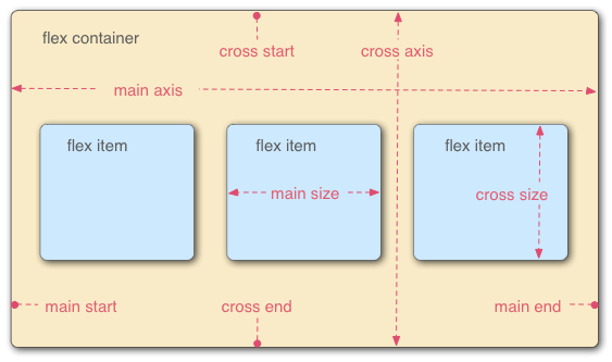 To make a flex container, give it
 display: flex.
flex-direction: row | row-reverse | column | column-reverse;
flex-wrap: nowrap | wrap;
justify-content: flex-start      /* Push items to left. */
                 flex-end        /* Push items to right. */
                 center          /* Push items to middle. */
                 space-between   /* Spread out with max distance between. */
                 space-around    /* Spread out with max distance around. */
align-items: flex-start          /* Anchor items to top of row. */
             flex-end            /* Anchor items to bottom of row. */
             center              /* Anchor items along a central line. */
             baseline            /* Anchor items along the text baseline. */
             stretch             /* Make items occupy full height. */
align-content: flex-start        /* Anchor to top. */
               flex-end          /* Anchor to bottom. */
               center            /* Anchor to middle. */
               space-between     /* Spread out rows with max distance between. */
               space-around      /* Spread out rows with max distance around. */
row-gap: 10px;
column-gap: 10px;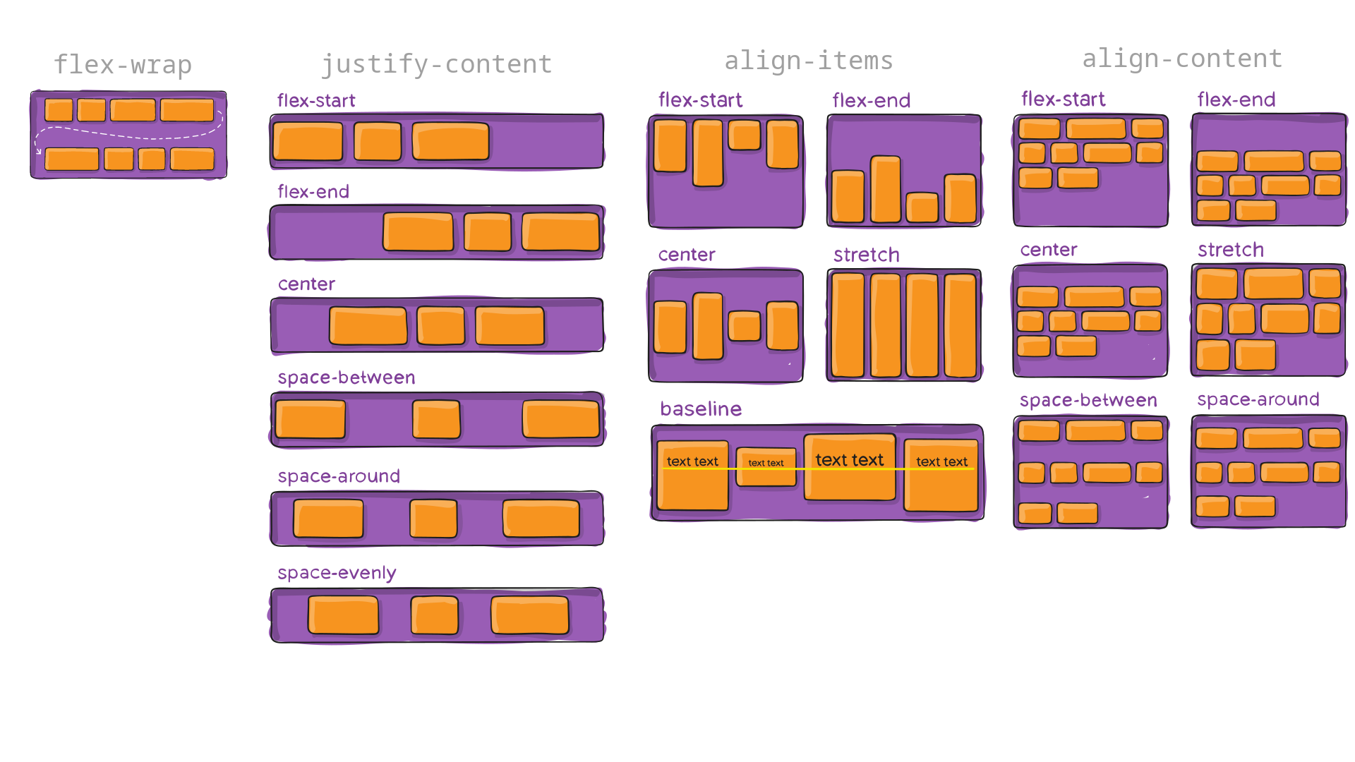 (images sourced from css-tricks)
Grid
To make a grid container, do display: grid and set the number of rows and columns with grid-template-rows and grid-template-columns.
/* 🛠️ Rows/cols of the grid. */
grid-template-columns: 100px 100px 100px;      /* Defines 3 columns. */
grid-template-rows:    25% 40rem 123px 10vw;   /* Defines 4 rows. You can mix units. */
                       repeat(20%, 5);         /* Expands to 20% 20% 20% 20% 20%. */
                       100px 1fr 4fr;          /* The `fr` unit takes a fraction of the available space. */
                       minmax(100px, auto) minmax(50px, auto);
                                               /* ^ `minmax` sets the min-height of the row while allowing
                                                    larger elements to take up the space they need (auto). */

grid-template: rows / cols;                    /* Shorthand for the above 2 properties. */

grid-auto-columns: ...;     /* Specifies size of auto-generated columns. */
grid-auto-rows: ...;        /* Specifies size of auto-generated rows. */

/* 🤏 Gap sizes. */
/* Just like Flexbox's `row-gap` and `column-gap`. */
grid-row-gap: 10px;
grid-column-gap: 10px;

/* 📏 Alignment. */
/* Just like Flexbox, Grid has `justify-content`, `align-items`, `align-content`.
   Grid additionally has `justify-items` that Flexbox ignores. */
justify-content: start;          /* Behaves analogously to Flexbox. Aligns along x-axis. */
                 end;
                 center;
                 space-around;
                 space-between;
                 stretch;
align-content:   start;          /* Behaves analogously to Flexbox. Like `justify-content`, */
                 end;            /* but along the y-axis.                                   */
                 center;
                 space-around;
                 space-between;
                 stretch;
align-items:     stretch;        /* Behaves analogously to Flexbox. Aligns along y-axis. */
                 start;
                 end;
                 center;
                 baseline;
justify-items:   start;          /* Like `align-items`, but aligns along the x-axis. */
                 end;
                 center;
                 stretch;
Any direct child element of the grid container is a grid item and can be positioned on the grid using the following properties:
/* Positioning in the grid. */
grid-column-start: n;    /* Pushes the item to the n-th column (starting from n = 1, not n = 0) */
grid-column-end: m;
grid-row-start: n;
grid-row-end: m
              span l;    /* Instead of specifying the start/end with an index, you can specify how many cells are spanned. */

grid-area: row1 / col1 / row2 / col2; /* Shorthand for the above 4 properties, spanning an area on the grid. */ (graphics sourced from css-tricks)
Just remember:
- ‘justify’ is for horizontal/x-axis, ‘align’ is for vertical/y-axis.
- ‘content’ is for container, ‘items’ is for items.
CSS Code Style
Some simple guidelines for writing maintainable CSS code. See MaintainableCSS.
- Prefer semantic class names.
<!-- Semantic -->
<div class="searchResults">
<!-- Not semantic -->
<div class="red pull-down m-2">
”… use values that describe the nature of the content, rather than values that describe the desired presentation of the content”
- Stick with a naming convention like this:
.module[-component][-state] { ... } /* Examples: */ .breadcrumbs-link { ... } .breadcrumbs-link-disabled { ... } .breadcrumbs-separator { ... } - Avoid using IDs just as hooks for styling.
- Avoid undoing styling rules, eg. resetting styles provided by bootstrap or by another one of your CSS rules elsewhere.
- Write comments as if you were documenting regular program source code, especially if you write rules that are meant to solve an issue. CSS is usually a huge pain for people, so please remember to help your future self, and especially others working with your code.